Monday, July 29, 2013

Magical Violet


Violet . . . the color of royalty and wealth. In ancient times and throughout the middle ages, purple dye was the most precious material in the world because of the difficulty - and therefore expense - of obtaining it. Only the extremely wealthy could afford the pigments for their portraits or the dyes for their textiles and interiors. 


Plus it looks is smashing when paired with its royal complementary - gold.


purple paint

Violet ranges from the red violets seen above....

Jamie  Drake
...to the blue violets seen above in this tranquil living space above. 

Because of its placement between passionate red and soothing blue, its physiological and psychological effects are neutralized or will be based on whether that violet color tends towards the reds or towards the blues. A red violet will be more energizing and warmer and maybe a better choice for enhancing skin tones in a bathroom and using an indigo or blue violet may be a perfect choice to use in a restful bedroom.

How have I never realized that I needed a purple harp in my life?
Pinterest
Historically, violet has been associated with magic and enchantments. Think Harry Potter! People who prefer violet tend to be eccentric, whimsical, enigmatic, and artistic and often violet interiors are eccentric, eclectic, and fantasy inspired, just like we see here. I think everyone should own a violet hued harp!


Markham Roberts
Violet trends more than other colors. Used as an accent,  particularly for decorative toss pillows or an accent wall color or in decorative accessories as seen here, makes it easy to change out as it waxes and wanes with our culture.


Lavenderandlovage.com

My question to you this week -- what magical elements will you add to your interiors through the use of violet.

Thursday, July 4, 2013

A Passion for Red


Red inspires excitement and danger! Think of your emotional reaction when you conjure up images of magenta stilettos or a cherry red sports car or an exotic room like below. Red sends really strong messages that just cannot be ignored. And why is that?

Studies show that people in who spend time in  red rooms have increased body temperature, blood pressure, and heart rate... and an increased appetite as well. And it's not only our appetite for food but all appetites:  drinking and lust and sex and spending money.  Watch out the next time you're on a shopping spree or lounging in a bordello!


I love the curved door, the lighted obelisks and the Renaissance details in the wall motifs
 in this rich interior.


lifamilies.com
Red flatters to our skin tones and as such is a n excellent choice where we want to see our best image-
like the bath or powder room.


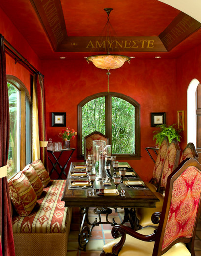
What color for the dining room?
 How about one that makes us want to linger, around beautiful looking people, and eat luscious, 
mouth-watering food with great gusto? No wonder it is the color for this area of the home!


sasinteriors.com
Add a bit of white to red and you get a sumptuous, delicious pink. Paired with white trim and furnishings, 
this room just exudes happy sophistication!


countryliving.com
Red constantly demands our attention, and it's not subtle in any way. Used judiciously in smaller ways, it can be a powerful little accent. The punch of red in this kitchen livens up an otherwise sterile room and
 touches it with just the right amount of charm and personality.


Rich, bold and powerful....Are you daring enough to use red?

Tuesday, May 28, 2013

Sunny, Happy Yellow

Yellow...the color of warmth, joy and comfort.  Its association with the sun has made yellow a symbol of divinity and power in major religions and Greek mythology throughout the ages. Its companion color, gold, speaks also of power as well as wealth and importance and is enjoying a renaissance of it own in modern times.

For what its worth, here is how we use yellow...and gold...in today's interiors.

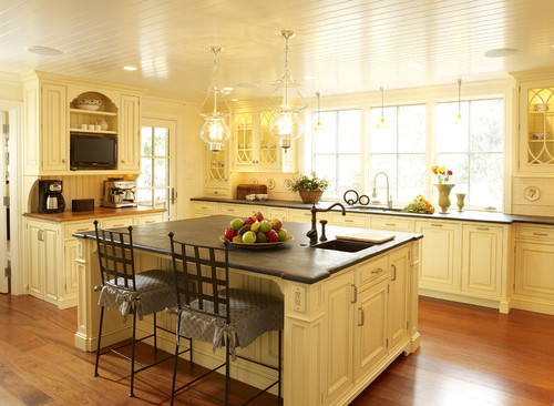
This lovely kitchen is so cheerful and airy, thanks to the French Vanilla cabinetry, glossy painted wood ceilings, and abundance of natural sunlight streaming through the windows. Lighter tones visually advance in a space, giving the appearance of a much larger room.
Design: Other Metro Kitchen And Bath - Peter Cardamone


yellow kitchen with recessed lighting fixtures
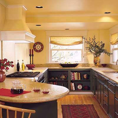
Today, we know yellow as a friendly, energetic color. I love the use of yellow here against the charcoal cabinetry and the crimson red accents. Imagine if these walls and ceiling (love the colored ceiling!) were painted in white. There would definitely be a different more subdued feeling as you walked into this room. With yellow, you just want to get busy and cook in here!


DP_Callan-mid-century-modern-living-room_s4x3
I love to use soft tones of butter or straw as a neutral on walls, which allows the artwork and furnishings to come alive. See how well it pairs with each individual color and the room as a whole.
Design by Robin Calland 


A wellcomming foyer is painted mellow yellow.
Yellow is the brightest and most reflective color on the color wheel and therefore a great choice to use in hallways and poorly lit or windowless areas. Mirrors, golden frames, and white ceilings also increase the brightness in this space. Such a lovely vignette!
Design by Kevin Sharkey; Image from Martha Stewart


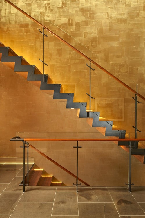
This modern staircase shimmers with gold leaf luxury.ArchitectMcClellan Architects


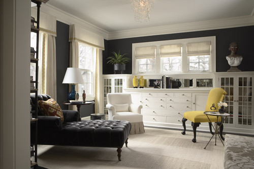
What a beautiful, sophisticated  room the designer has created here through the use of tailored details like the banded draperies and box pleated chair.  The elegant black walls and chaise could be overbearing and somber if not for the counter point of buttery yellow which lightens and brightens the mood of the room.
Design
: Mary Hickey Interiors


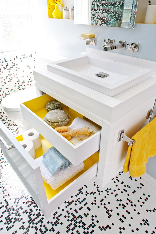
A new trend in cabinetry offers personality plus when you open a drawer. How much fun to pair black and white with citrine yellow --  a perfect use for this sunny, happy color!

❤ - RENE LALIQUE  (1860 - 1945) Art Deco Vase "Tourbillons", ca. 1920.  Yellow glass. @designerwallace
Rene Lalique c. 1920


Whether it's marigold, French vanilla, butternut squash or corn silk, yellow will make your home feel lighter and brighter. What is your favorite shade of yellow?

Saturday, March 2, 2013

Zesty Zippy Orange


How much fun to bring vibrant, energetic orange into an interior setting! Studies show that orange rooms inspire creativity and conversation while also stimulating the senses. Orange reminds us of sunsets, spices, fire and heat and can be successfully used in physically cooler rooms to psychologically warm those spaces. Fascinating!

For what it's worth, let's look at these inspiring and welcoming  interiors, and how they apply orange at its best.


An orange palette in various shades of terra cotta, pumpkin, tangerine and sorbet, unite this room and create an inviting, happy place to visit and enjoy.
Zuniga Interiors

Pinned Image
Mango, pumpkin, apricot, paprika, nectarine and persimmon-- flavors and tastes promoting health and nutrition complement our interior - and flavor - palettes.  Definitely my favorite color to use in a kitchen as it promotes creativity, conversation, and appetite!
Kitchens.com

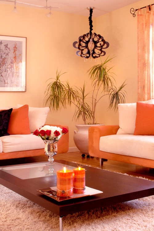
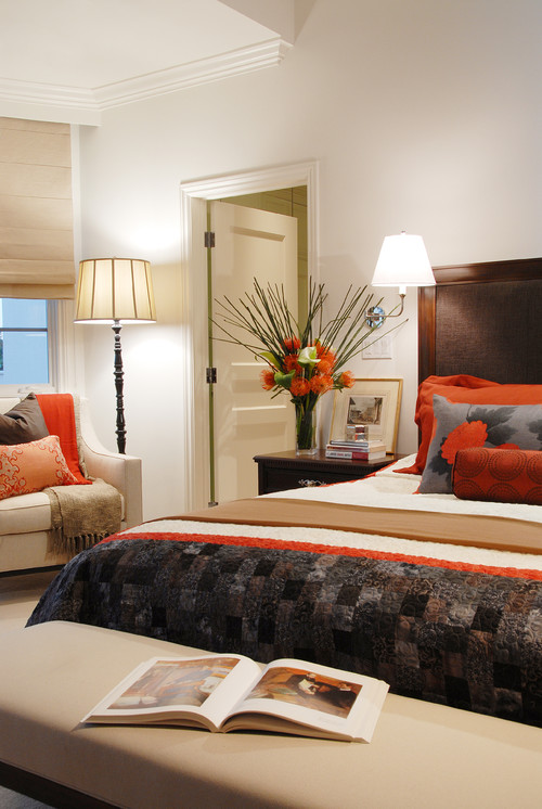
  Adding white to orange creates the tint of peach found in these walls,  adding black creates the brown tones seen here in the chandelier, toss pillows and coffee table. Don't forget that many wood tones are actually composed of orange undertones and are extremely rich when paired with this vibrant palette.
 ARTISSIMO - Idit Deutsch

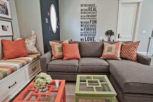
Don't you love the "House Rules"? And of course, the soft mints and salmons
work perfectly against the soft blue grey backdrop
.
 
Jill Wolff Interior Design
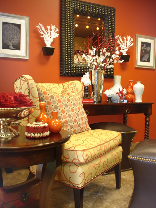
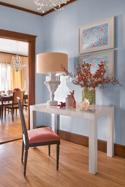
On the color wheel, orange is positioned across from blue, which pairs into a harmonious complimentary scheme. Note the varying shades and tints of orange - from the salmon seat fabric to the deep paprika colors of the florals and accents - which are repeated in the cherry blossom motif of the art.
 Mandarina Studio

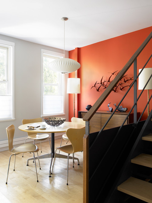
Orange can prove a very powerful color. If it feels too overwhelming to use in an entire room, 
apply it to a single, focal wall .....
CWB Architects

 ...or sprinkle it throughout as accents in toss pillows and accessories. It is smashing here with 
the splash of lime and heathered greens.
Annette English
Oranges are great to use in baths as they reflect a healthy flattering glow 
with our skin tones. How fantastic to walk out of any room thinking "I look my absolute best"! 
Stunning sconces!
Schippman Design
Vintage glass.

Zesty, zippy orange ... love it or hate it ... is one of the more controversial colors on the wheel. 
Tell us your feelings about applying orange in your world.

Monday, January 28, 2013

Why We Love Blues

Blue - the color of endless skies and tranquil seas - has historically been a favorite and currently is enjoying a renaissance in interiors. Like its color wheel neighbor green, it is associated with the environment, a strong social issue today, and therefore has staying power, making it a good long-term selection to consider in your color schemes.


Love the subtle beach accents and the finish detail  at the carpet edge
 Tumblr.com

Why is blue such a great choice to use in your bedroom? Studies done on productivity for the war effort in the 1940's showed that when people were placed in a blue room, their heart rate, blood pressure and body temperature decreased.  Therefore is it a very tranquil, calming color to gaze upon and ...for what it's worth...perfect in a bedroom!

https://s-media-cache-ec4.pinimg.com/upload/89509111315615427_586aRoLl_c.jpg
Bunny Williams.com


A few well-selected accessories--the trio of mirrors, birdcage, personalized linens and beaded chandelier make this pastel blue room one to dream in!
followpics.com

Love the fingerprint rug with the aqua hues of this room!


Navy blue is wonderful when contrasted against a crisp white! Also note that while these walls are painted a strong and powerful shade of blue, there is plenty of white space in the casings, wainscot and hanging art to keep the space from being oppressive.
fancycribs.com


40 Friendly and Fresh Blue Interior Design Ideas
Don't forget the blues found in views, florals, and Chinese porcelain.
fancycribs.com


Although I am not usually a fan of blue in bathrooms- it does not enhance our skin tones- it can create a relaxing spa-like environment and in a large space like this can work beautifully.
houseofanais.com


So the constant, celestial, tranquil blue. My family room has a deep marine blue accent wall to bring serenity at the end of our day. What room will you paint blue?


Friday, January 25, 2013

2013 Color of the Year - Emerald


Each year the design industries - fashion, home decor, and automotive, to name a few - anxiously await the announcement of Pantone's Color of the Year. For 2013, the color is Emerald Green. While this certainly has some of us arching our brows in surprise, there is reasoning and logic behind the choice. Design decisions are often a reaction to previous trends and the cool, soothing balm of luxurious gemstones and deep forest foliage are a counterbalance to last years hot and zingy Tangerine Tango. Green historically has been a prominent color in our interior landscapes, trending from avocado to sage to lime to...emerald over the past few decades, mostly because the color green is tied to a very large and emotional social issue, nature and the environment.

For what it's worth, here's a look at using Emerald Green in our homes.....


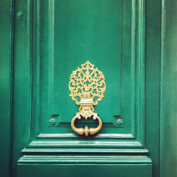
Beautiful when paired with warm antique brass, this rich accent color sends an inviting welcome and emphasizes the entrance to the home.


Emerald green can be overpowering if not handled with respect. Here it is softened by a rubbed paint treatment, complemented by the pink, and further toned down by the creamy furnishings -- all perfect in this girl's room. I love the elegance of the beaded chandelier - a throw back to an earlier age of luxury.

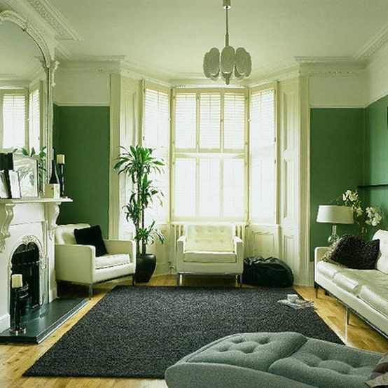
Emerald is lovely when paired with modern black and white furnishings. I love that the color does not go to the ceiling; it opens the space visually from above. Imagine how dead this space would look with white walls!


Alexander Doherty Apartment Design - Farrow and Ball Paint Colors - House Beautiful

I looooove lilac and emerald together. What a lovely vignette!

Alexander Doherty Apartment Design - Farrow and Ball Paint Colors - House Beautiful


Emerald for 2013. 
Look for it in fashion at this year's Academy Awards and home accessories like malachite picture frames, table ware, and obelisks, and even appliances for the kitchen.
.

blog.jocosiding.com
.
 What will you do with emerald in your interiors? Do you have a favorite shade of green?


Photos courtesy of  Benjamin Moore unless otherwise noted